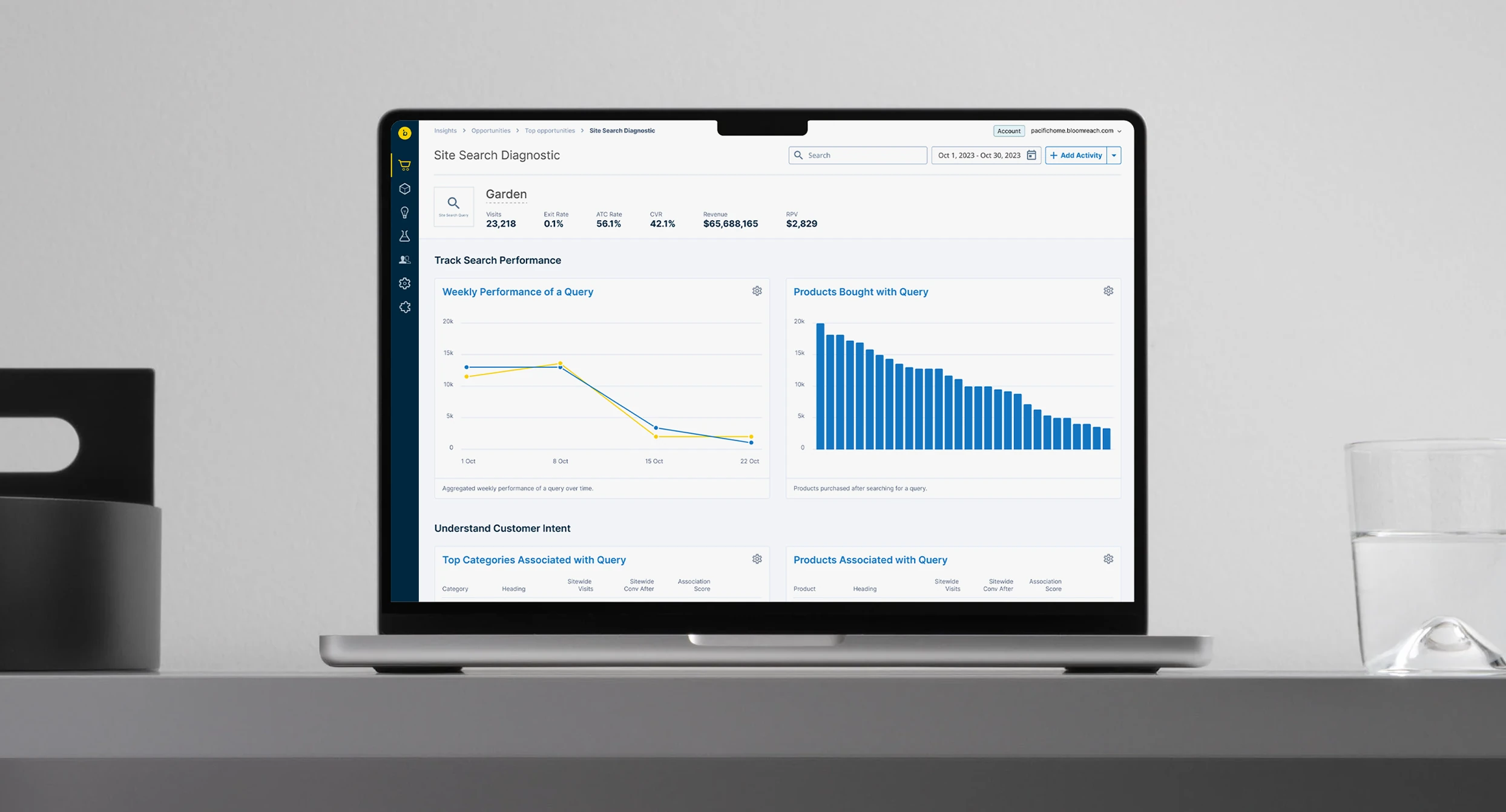
Bloomreach Insights
Redesigning Bloomreach Insights as an action-oriented analytics product — one that doesn't stop at telling a merchandiser what happened, but helps them understand where to act next.
Bloomreach already captured enormous amounts of behavioral and performance data — revenue per visit, conversion, search behavior, exit rates, zero-result queries, product performance. The harder problem was turning those signals into useful merchandising decisions.
Insights was designed as an action-oriented analytics product, helping ecommerce teams understand where the customer experience was underperforming and where intervention could make a difference. I redesigned the experience around a simple principle: don't stop at telling the user what happened — help them understand where to act next.
The product had data. Users needed hierarchy.
The existing Insights experience had accumulated a large amount of commerce data and AI-driven information. That created a familiar analytics problem: everything could be useful, but not everything could be equally important at once. Dense information, difficult navigation, and a fragmented interface made it harder for merchandisers to establish context before deciding where to focus.
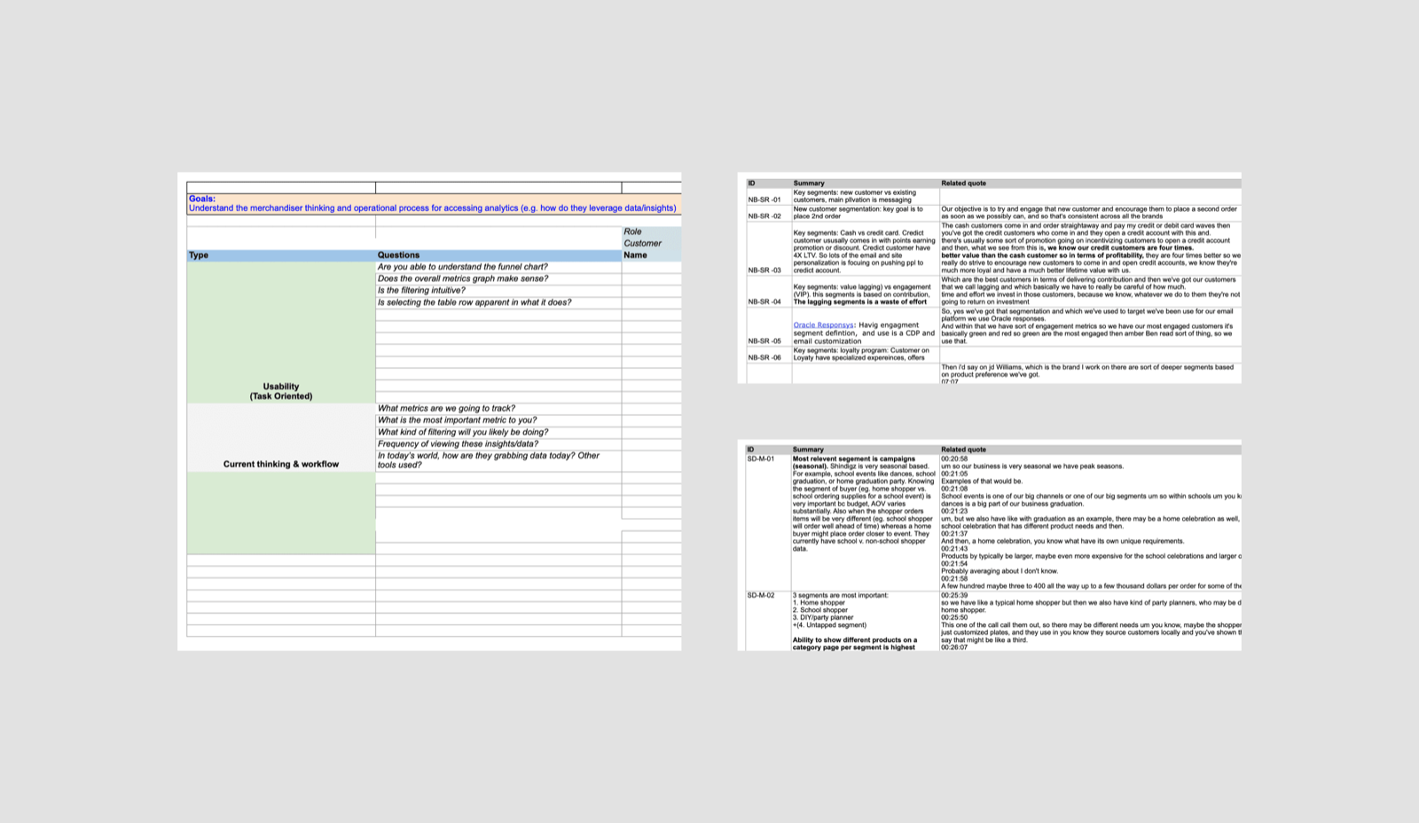
The redesign started by asking a more useful question than how should we display all of this data? Instead: what does the merchandiser need to understand first? The interface needed to establish a progression — what happened, why does it matter, where should I investigate, and what can I do about it.
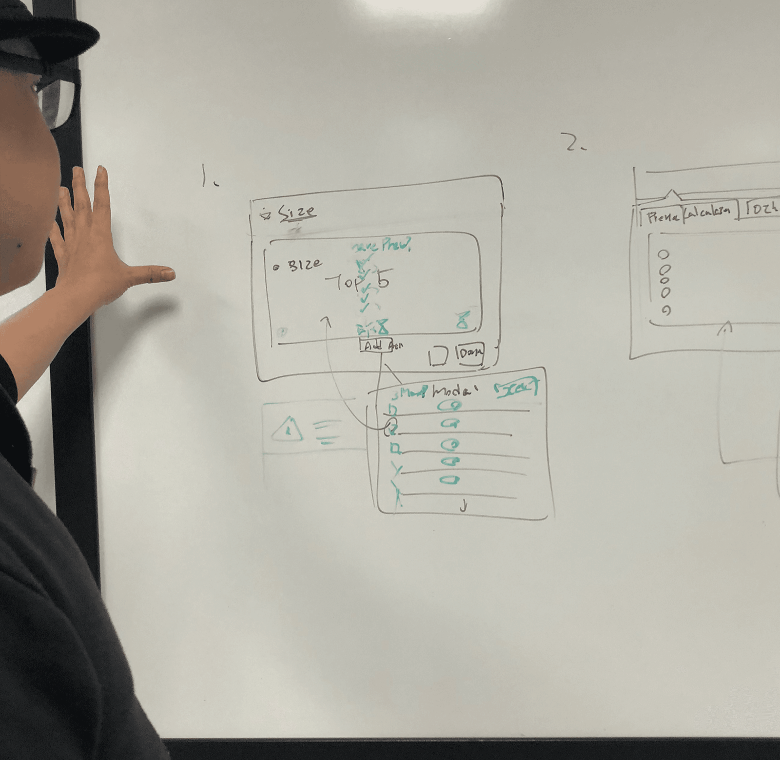
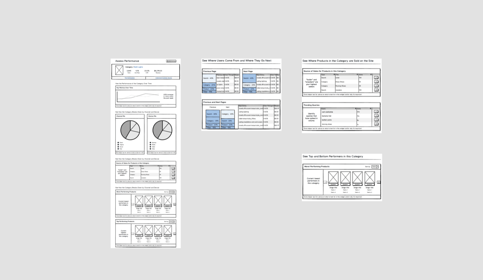
Organizing the information around questions — from orientation to investigation — before a screen was drawn.
Give the growing product a stable frame
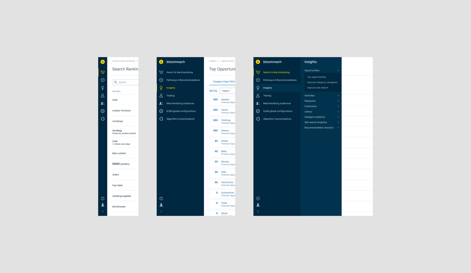
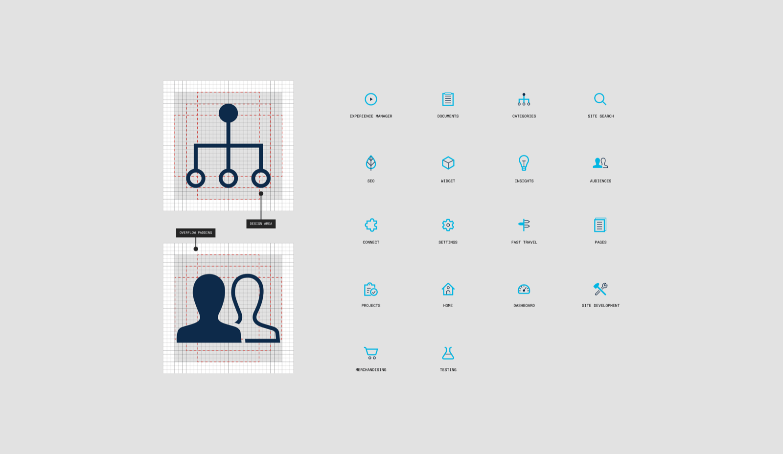
One of the first structural changes was navigation. As Insights expanded across analytics, merchandising, site search, trending products, and AI-generated recommendations, users needed a persistent model for where those capabilities lived.
I introduced a persistent sidebar that gave the product a stable hierarchy and kept major analytical contexts visible as users moved through the experience. This wasn't simply a new navigation style — the goal was to reduce the amount of orientation work users had to perform before engaging with the data itself.
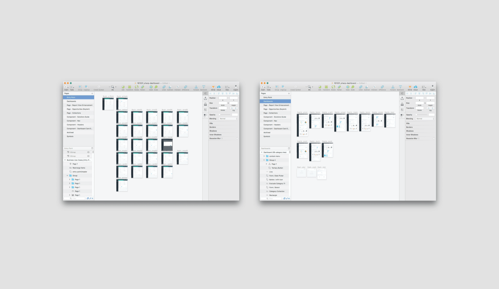
A stable frame for a growing product, structured so new tools could be added without collapsing the logic already there.
Turn commerce signals into merchandising opportunities
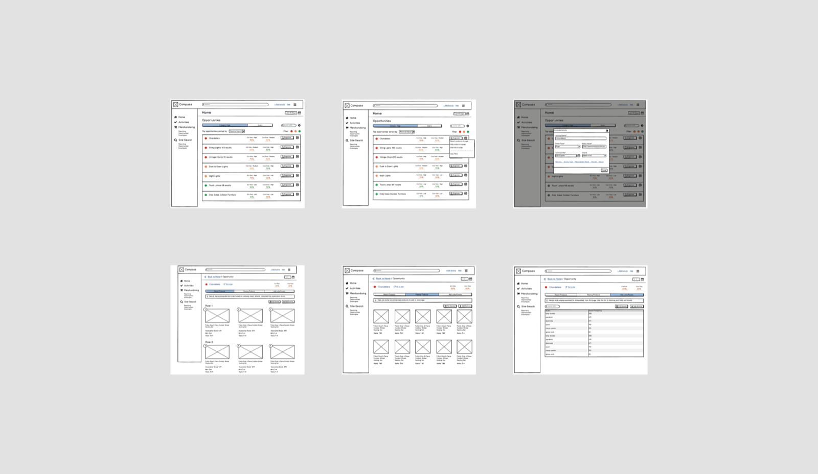
The value of an insight wasn't that Bloomreach had detected something unusual. It was whether a merchandiser could understand why it mattered. Insights surfaced situations such as high-performing products receiving too little visibility, search queries attracting traffic but generating little or no revenue, queries with high exit rates, and search terms repeatedly returning zero results.
Each signal represented a different business question. Was a successful product being overlooked? Were shoppers finding results that failed to meet their expectations? Was a relevant product missing from the result set altogether? The interface needed to connect the signal with enough evidence to support investigation — and the user still needed to understand what the numbers referred to and where to go next.
Surface the opportunity, make the evidence understandable, and clarify the next step.
An insight could suggest where to look. The merchandiser still brought the business context needed to decide what to change.
An insight wasn't finished until the user knew what to do next
A technically accurate recommendation could still leave the user with work to do. They had to understand what triggered it, decide whether it mattered, and translate it into a merchandising decision. I designed around that transition between analysis and action.
Consider a query that attracts substantial traffic but produces little or no revenue. The initial signal gives the merchandiser a place to start; supporting data helps them assess the problem; and an examination of the results can reveal what deserves closer attention. The response depends on what they find — investigating relevance, changing product visibility, or addressing products missing from recall. The signal alone doesn't establish the cause.
The experience needed to preserve that context as users moved from an overview into the detail: the affected query or product, the relevant performance information, and the next available step, all kept connected. The design goal was a shorter conceptual distance between noticing a problem and knowing how to investigate it.
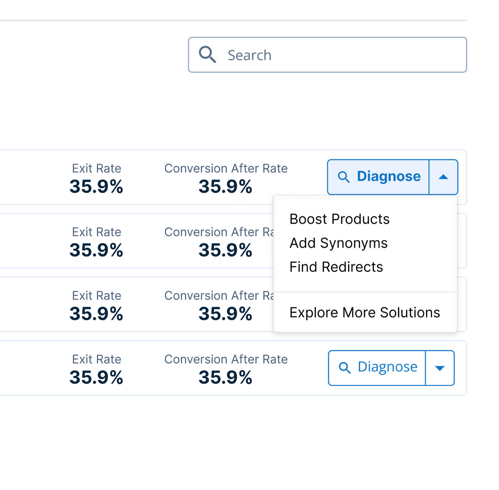
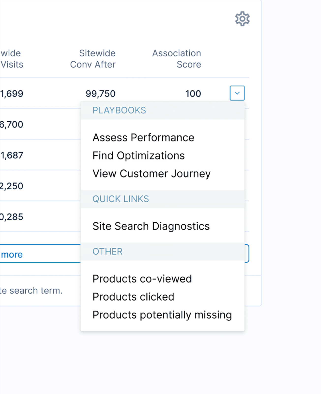
Signal, context, and next step kept together — never just a number.
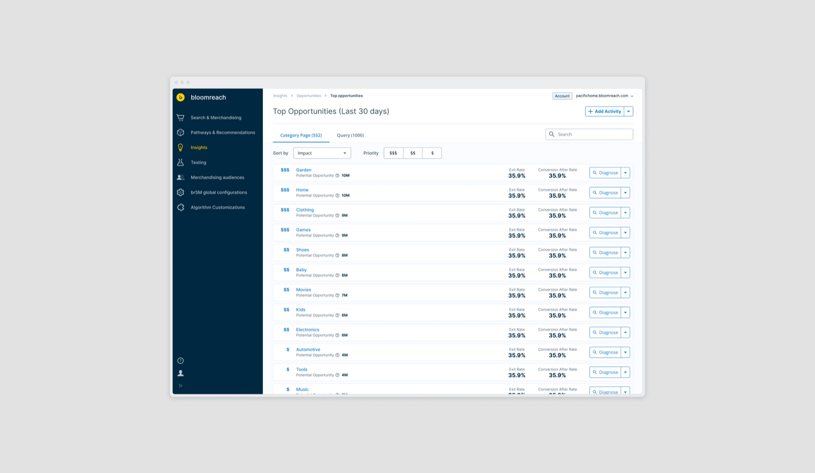
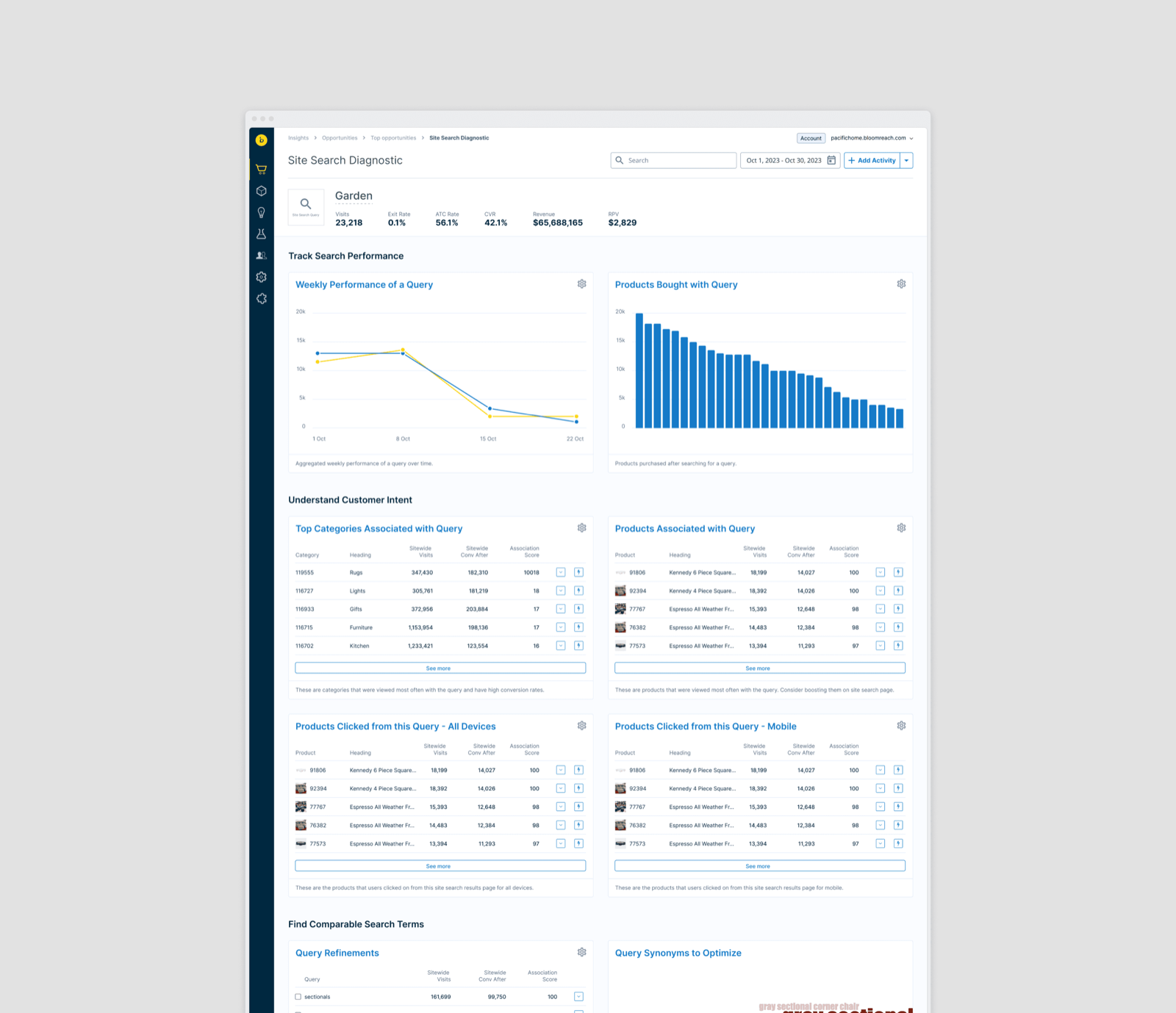
This also explains how the two Bloomreach products relate. Insights helps a merchandiser identify where attention is needed; Product Grid Editor provides the controls for expressing merchandising intent. Together they support a broader cycle of understanding and intervention — a relationship in how the work is framed, not a claim of a one-click handoff between them.
A richer visualization carried a real cost
One direction explored interactive geospatial maps as a way to make parts of the dataset easier to explore. The idea was visually compelling. At production scale, it came with significant costs: processing dynamic event streams created query latency, client-side rendering placed heavy demands on the browser, the maps behaved poorly across responsive layouts, and they required disproportionate engineering upkeep compared with the actionable value they provided.
The trade-off was broader than choosing a visual style. We had to consider the entire experience of reaching, reading, and maintaining the information. We moved toward optimized charts and tables instead — a more practical foundation for the comparisons merchandisers needed to make, and a better fit for the product's performance, responsive-layout, and maintenance constraints. That choice gave up some exploratory richness and visual novelty. It prioritized the clarity and reliability of the core analytical work.
A visualization earns its complexity by helping someone make a better decision.
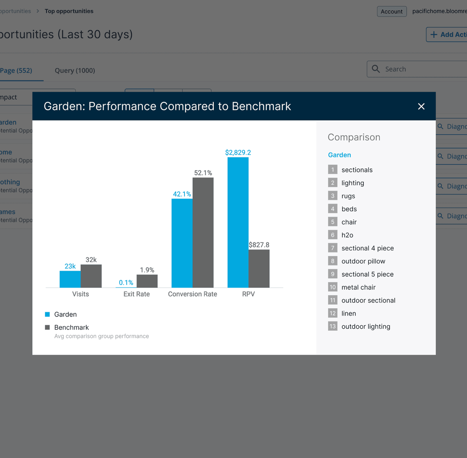
Make dense information easier to compare
Replacing the map was only one part of the visualization problem. The rest of the interface also needed to help people read a large amount of information without treating every element as equally important. The work brought navigation, hierarchy, and data presentation into the same design problem: establish the analytical context, identify the relevant signal, then examine the detail required to make a decision.
Charts and tables played different roles within that progression. Charts could make patterns and changes easier to see; tables could preserve the detail needed to compare individual queries or products. The goal wasn't to remove the depth experienced merchandisers needed — it was to give that depth a clearer structure, with enough emphasis to establish a starting point while keeping the supporting information available for investigation.
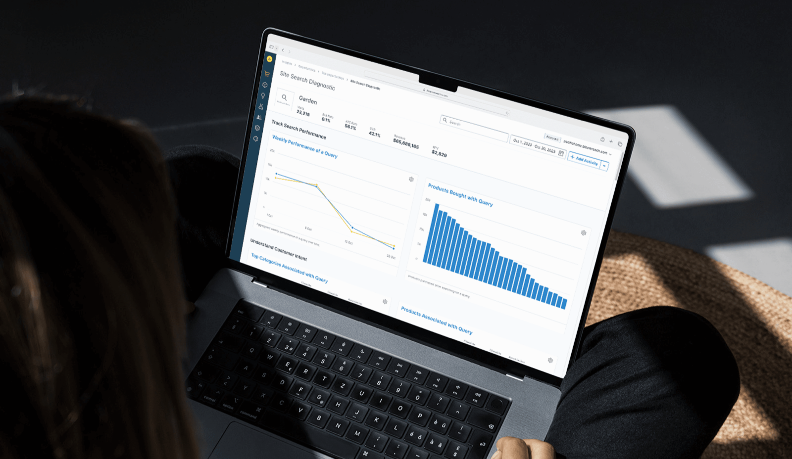
Carrying the design through implementation and testing
Insights shipped to production, and my involvement continued through implementation and testing. As the sole primary designer, I worked under Design Director Albert Wang and partnered with product management and engineering throughout — from the structure of the experience down to the details of the delivered interface.
The map-to-chart transition made the importance of that continuity especially clear. A design could look convincing in exploration and still carry costs that only became obvious against the real data and implementation constraints. Staying through delivery connected those constraints back to the design decisions. The outcome was a released product, with the UX work carried through the full loop rather than ending at a set of screens.
Impact
The redesign gave Insights a more coherent structure for navigating commerce data, understanding performance signals, and identifying where to investigate next. The persistent sidebar established a stable frame for the growing product; the information hierarchy connected the overview to supporting detail; and the move from interactive maps toward optimized charts and tables addressed the performance, responsive-layout, and maintenance constraints encountered during the work.
I don't currently hold recorded post-launch impact metrics for this work. The outcome I can substantiate is the delivered product and the design decisions behind it — changes in conversion, revenue per visit, drop-off, or workflow efficiency would require additional evidence.
Clarity is part of the analytical work
Insights reinforced that access to data is only the beginning of a useful analytics experience. The interface has to establish what the user is looking at, why a signal deserves attention, and how to investigate it — navigation, hierarchy, and visualization all contribute to that understanding.
The map exploration also sharpened how I evaluate design trade-offs. A more expressive visualization can introduce real costs in latency, rendering, responsive behavior, and maintenance, and those costs need to be justified by the value they create for the person making a decision. The lesson I carried forward was to judge analytical interfaces by the quality of the understanding they support — and to stay involved long enough to see how those decisions hold up in the delivered product.
Bloomreach Insights case study